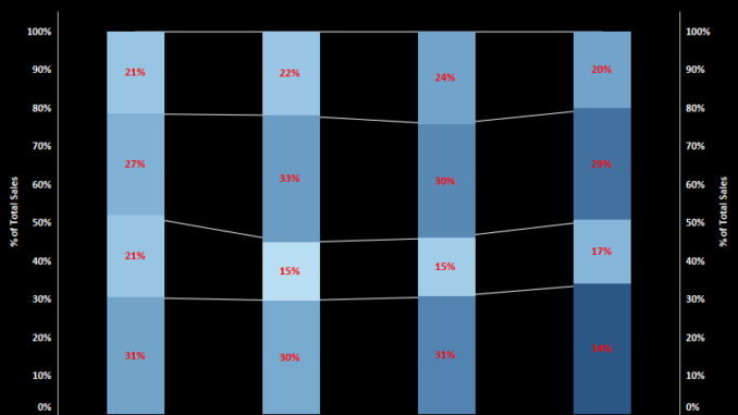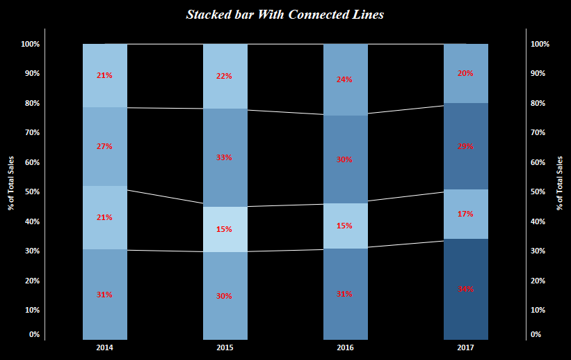
Today we will discuss about how to construct a stacked bar with connected lines in Tableau . To set the context this is what we are up to :

Here we see that we have stacked bar chart for the Sales across years. Each year sales is divided by regions . Also along with the bar we have a line that acts as a connector between the bars and shows a trend of sales by region .
To construct this we will use our sample superstore data.
Lets go step by step and get this done.
Step 1: Drag Sales to rows and order date to columns.
Step 2: Change the marks type to bar.
Step 3: Bring region on to the Detail mark. Add sales to the color mark . This is what your screen should look like now:

Step 4: Change this bar chart to stacked bar chart showing percentage value. To do this right click on the Sales measure on rows and from the quick table calculation select percent of total . Compute this down the table. Your screen should look somewhat like this:

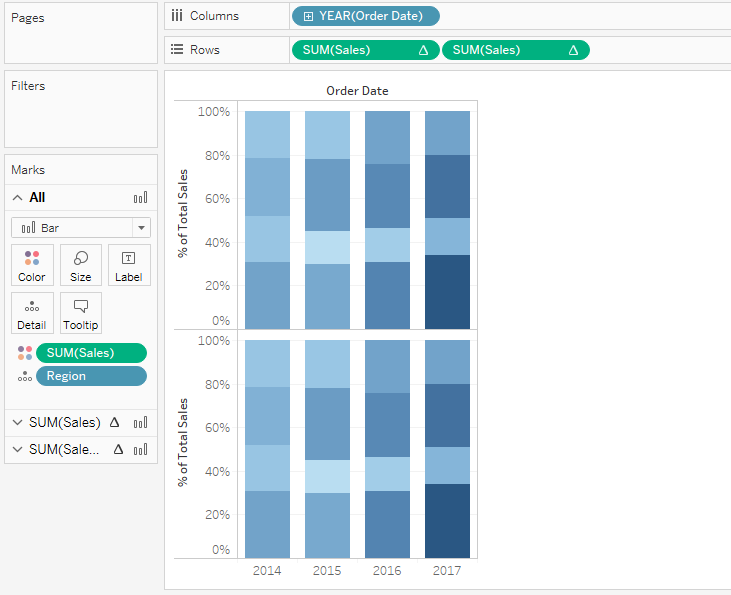
Step 5: Press Ctrl and copy the Sales measure to the the rows . This will split your screen into two charts like this:

Step 6: Right click on the second sales measure and select dual axis.
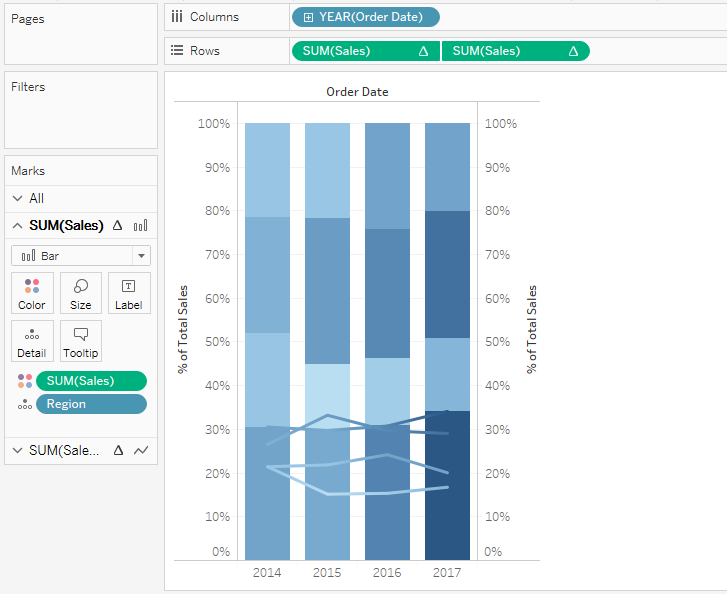
Step 7: Change the mark type for this to lines. Synchronize the axes. Your screen should now look like this:

Step 7: Move the lines backward by changing the position of the measures in rows.
Step 8: Go to analysis tab on the toolbar and in the dropdown look for Stack Marks. Select the option ON.

Format your chart by changing the color of the line and adding labels to the stacked bar and you are good to go.
Hope you guys followed the post. Let me know if you face any difficulty in the illustration.
