Hi All,
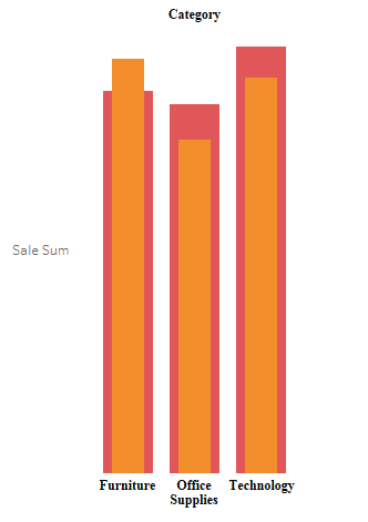
In today blog I will write about how we can create a bar chart within a bar chart . This is how a bar under bar charts looks. I have used the Sample Super store data for this illustration :
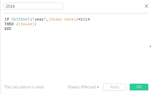
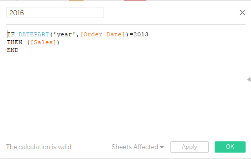
To do this we create two calculated fields that would give us the sales for 2014 and 2016 respectively.
Step 1: 2014 Sales
Step 2 : 2016 Sales
Step 3: Bring category to the Columns and Sales(2014) to the columns. Select bar Charts.
Step 4: Place the measure Sales (2016) on the axis and this the following view that you will get .
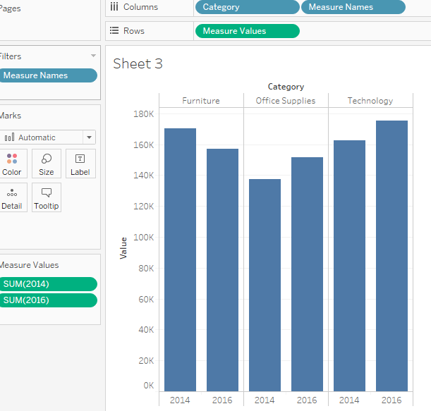
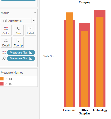
Step 5: Drag the measure name to the column and from the dropdown of Analysis select Stack Marks > Off. This is what your screen should look like now.

Step 6: Now press Ctrl and drag measure name to the size mark . Adjust the size to get the desired result .

Hope you guys enjoyed it . Do let me know if you are not able to follow.
Thanks.
Rahul Singh
