Hi All,
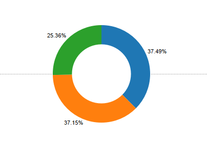
In this blog I would talk about creating Donut chart in tableau step by step ,
Step 1: Import the excel file in Tableau . The format of the excel file is as under. The excel has three columns : Category, Sales and the year for sales .
Step 2: In the worksheet tab of tableau , create two measures 0, 0(1)
Step 3 : Bring the measures 0 and 0(1) in the Rows shelf and select dual axis for SUM(0)
Step 4 : Go the All under the marks card and remove the measure name from the colour.
Step 5 : Under the marks card select SUM(0(1)) and select the chart as pie.
Step 4 : Bring Category to the colour .
Step 5 : Increase the size of the chart.
Step 6 : Add Sales to Angle.
Step 7: Place the Sales measure on the Label and add a quick table calculation as % of Total.
Step 8 : Select SUM(0) under the marks card .
Step 9 : Change the colour to white.
Step 10 : Decrease the size of the circle to get the Donut Chart.
Format the colours and the size of the chart to your desired choice to get the final Donut.
Hope this post helps you.
Keep visiting this blog for step by step approach for best visualizations using tableau.
Please post any questions if you are not able to follow.
Thanks.


