Hi All,
This is the first in series of my News Makeover in which I would be building vizzess based on news articles that I read across.
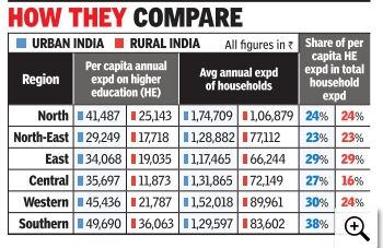
I was reading a article in Times Of India that talked about the spending on higher education across India as a percent of total household spending.
You can find the article here.
Although the article was a great source of information, however what I did not like was the way in which the data was presented. A lot could have been done with the data intead of just numbers in columns.
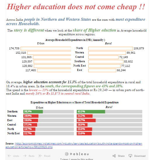
I tried my luck and with the data available built up a dashboard in Tableau .
The upper part of the dashboard compared the Average annual spending on Household across regions in Urban and Rural Areas . I used a butterfly chart for the comparison and it came out very well.
In the low half of the dasboard I have tried to visualize the % Value ( % spent on Higher Eductaion) in a target bar chart .
Here is what I was able to achieve.
Intial Visualization on TOI :

And this is what I did with the above data .

The dashboard can be viewed in Tableau Public here .
Comments are appreciated.
Thanks
Rahul Singh

Thanks John. I am using web hosting services by Godaddy.