
Hoping that you guys enjoyed the previous blogs regarding Visualizing Time series and Circles with common base. Continuing to our posts on Circles , here is another one : Visualizing calendar dates in circular view.
The idea is to represent all the dates in a year in the form of a 7 layer circles with the dates clustered by months.
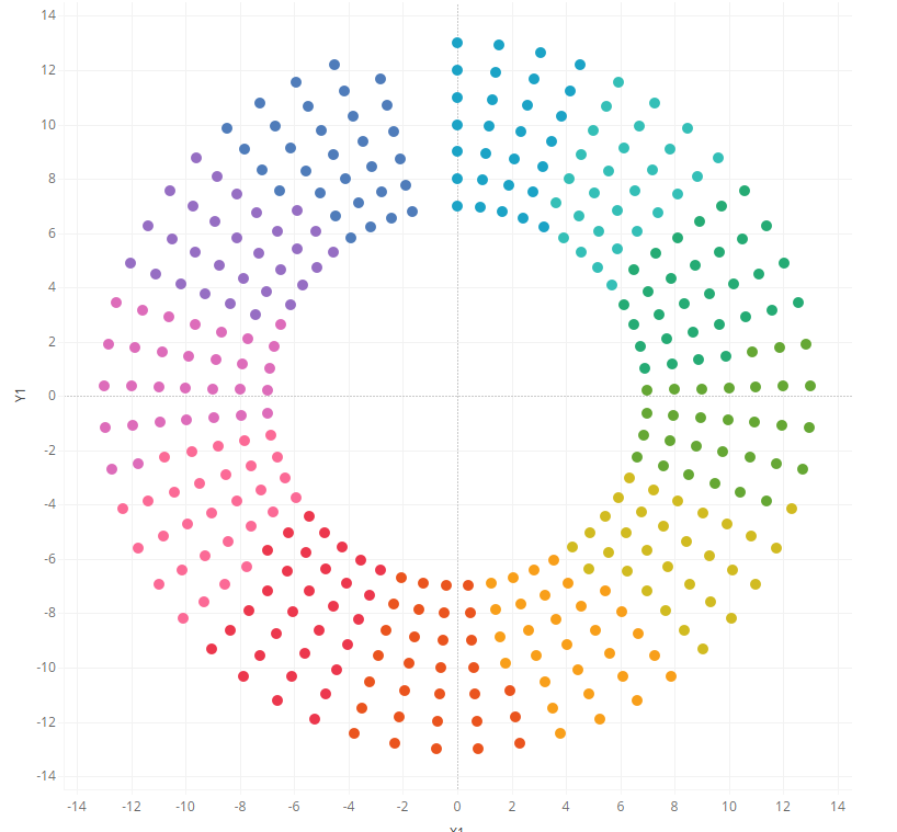
Here is what a circular calendar chart looks like.
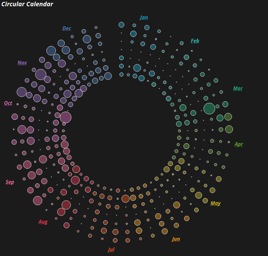
The above chart represents the dates for a calendar year in a circular fashion.
Lets import our sample super store data into Tableau public and create this chart using the following steps.
Step 1: Create parameters Depth and Distance from the center as under:
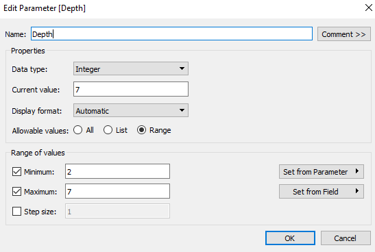
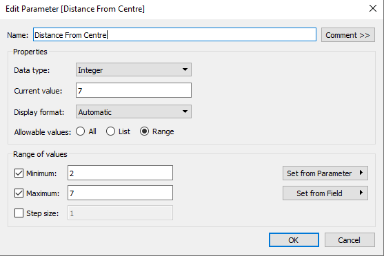
Make sure the current value of these parameter is 7.
Step 2: Create the following calculated fields Distance, Index, Item, Multiplier, X and Y as under:
Index: Index()-1
Distance: ([Index]%[Depth])+[Distance From Centre]
Multiplier : 360/53
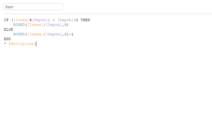
X: SIN(RADIANS([Item]))*[Distance]
Y: COS(RADIANS([Item]))*[Distance]
Step 3: Drag the order date into filter and select any year from it so that the data is filtered for one year.
Step 4: Bring order date to the columns pane , right click on it and then select the option that says “Show missing Values”
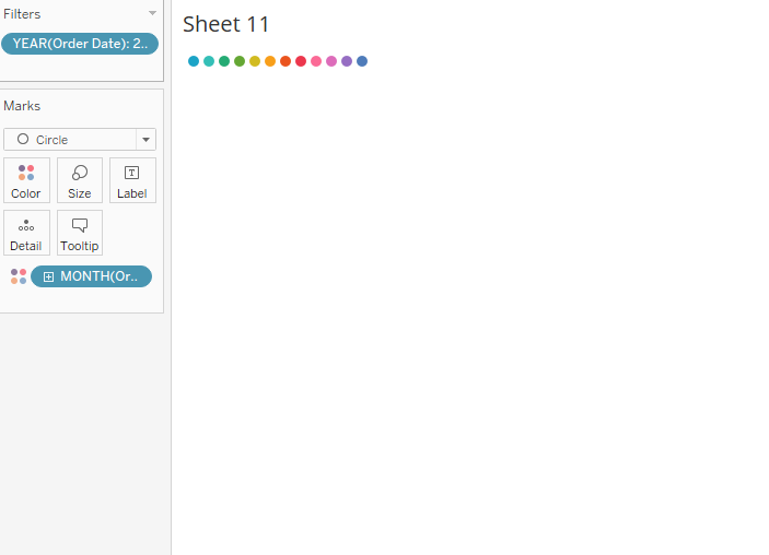
Step 5: Bring the order date field from the columns to the color shelf and select discrete month from the dropdown. Your screen should now look as under:
Step 6: Next drag order date to the details pane. Right click on the order date and select exact dates.
Step 7: Bring X to rows and Y to columns , right click on both of these feilds and cmpute them using order date and there you go , your calendar chart is ready in the form of a circle.
Format the chart, remove the gridlines , hide the axis and bring some measure value that you want to investigate on the size marks.
Hope you guys find this informative and I am really exited to know how you pln to use this chart. Mail me ( rahul@vizzingdata.com ) in case you are not able to follow any of the steps.
Happy learning !!