
First of all A Happy New Year and decade to all those who are reading this. Last year was quite a busy one and I was not able to contribute to my blogpost. Well I will try to make up for that in this year. I am planning to have a blog post every week on Tableau , R and Statistics , so stay tuned for all the learning this year :).
In today’s blog we are going to look into representing a time series data on Tableau in the form of radial dots .I came across a viz by Lindsay Betzendahl : The Cycle of Influenza and was quite fascinated to recreate it. You can follow her blog here where she gives a complete description about the steps to create this chart.
For today’s exercise we are going to use a sample data-set to recreate the chart. Here is the data set that we would be working with.
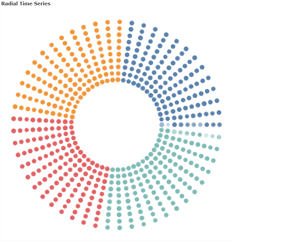
Before we start that let us try to understand what is a time series data and what do we mean by plotting it radially. The following chart would give us some perspective about it.
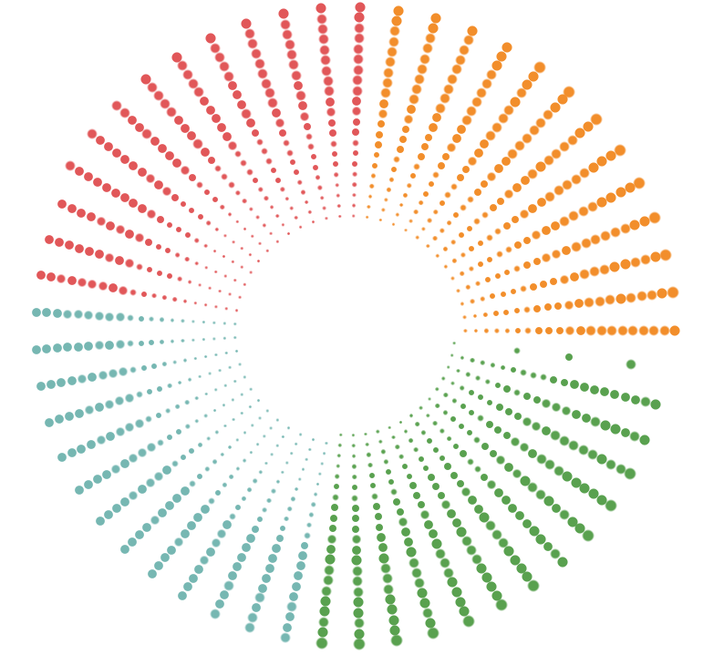
The chart that we see above represents the weekly sales for year from 2000 to 2019, the inner most circle is for the year 2000 and the outer most circle is for the year 2019. The chart is colored by four season ( categorized by week number , season 1 : week 1-13 , season 2 : week 14-26 and so on ).
When these charts are used for time series data-set a lot can be inferred from them , for example if we are looking at a data-set that had weekly number of patients across year for a specific disease the chart can help us in getting insights into which season the disease occurs most.
Lets try building this chart in tableau step by step .
Step 1: Import the excel file in Tableau.
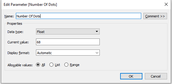
Step 2: Create a parameter for the number of dots to be represented
Parameter (Number of Dots )
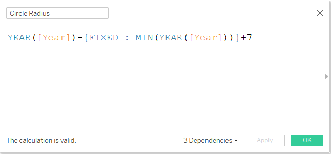
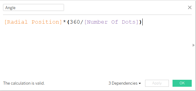
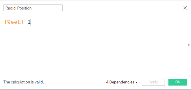
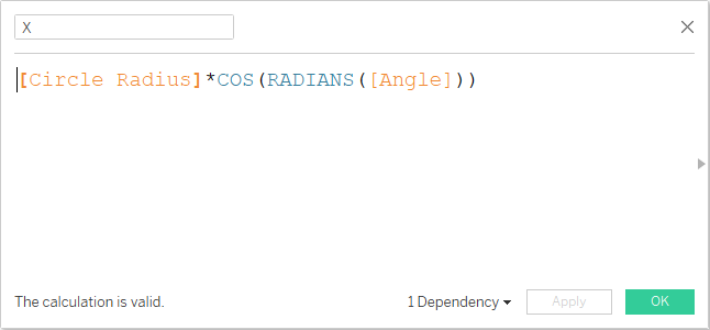
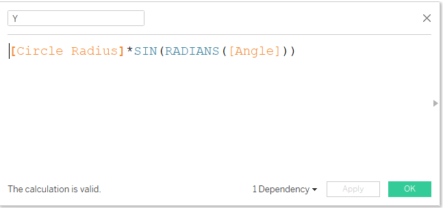
Step 3: Create calculated fields for Circle Radius, Angle , Radial Position and X & Y ordinates as shown below :
Once all the fileds and parameters are in place lets bring these at differest marks positions on the worsheet to get our chart>
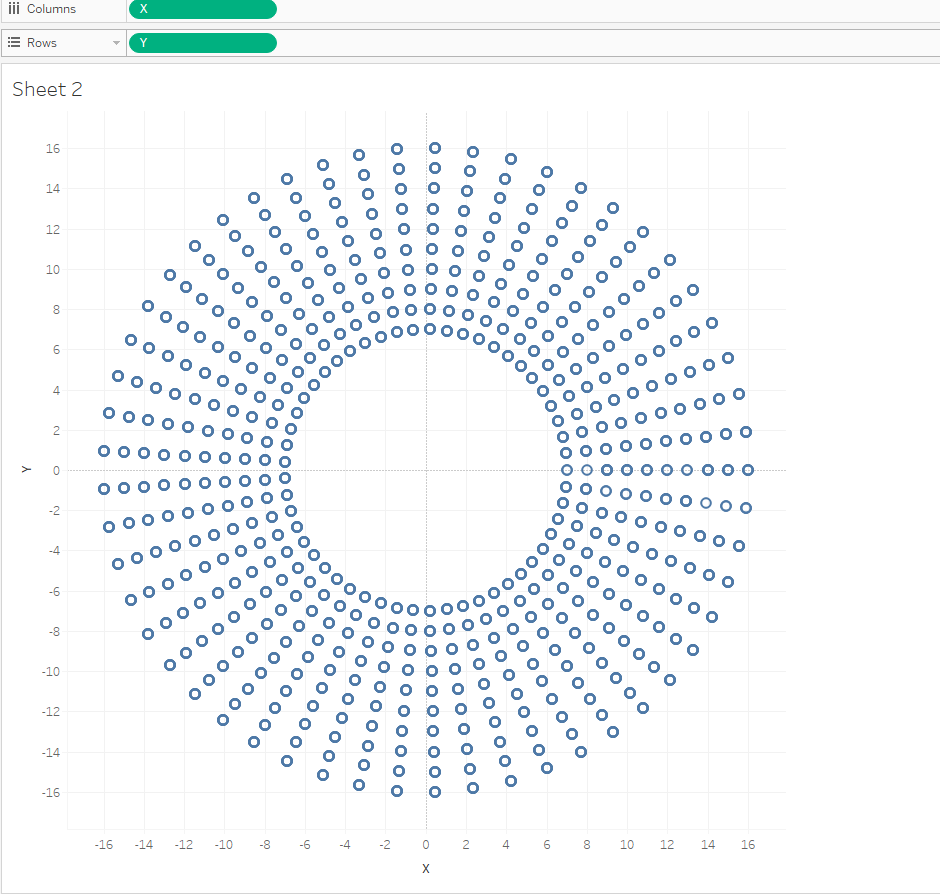
Step 4: Drag X to columns pane and & to Rows pane , from the Analysis option at the top pane unselect the Aggregate measures option.Click on the parameter create and then sow parameter control. Change the value of the parameter to 53. Your worksheet will be looking similar to the following image now:
There we are , now you can change the marks to circle and then bring the measure( sales ) on to the size of the dots , on done get the information that you want to display on the tooltip and finally add the color to the chart . Hide the axes and format the chart ( remove gridlines ) to have a neat view as under .
What Next ??
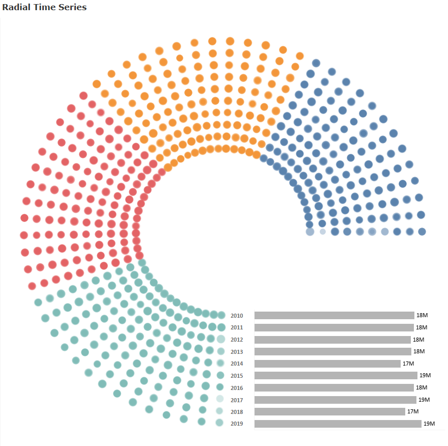
Use this chart with a combination of bar chart to show the total sales across year as under. I will leave this as an exercise for you guys. Mail me in case you are not able to figure it out. (Hint: change the parameter value)
Hope you guys had fun building this. Do let me know how you use or plan to use this chart.
If you liked it do not forget to share it !!
Happy Learning!!!!