Hi All,
In this blog of Advanced charting series I am going to talk about how to build a Up Down arrow chart in tableau.
A up down arrow chart is useful when we are comparing one value to other and want to see if the value in question is more/less than a specific value.
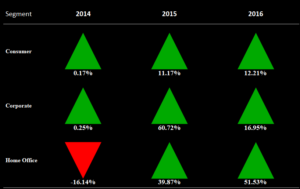
To understand the context this is what a up-down arrow chart looks like :

The chart basically compares the sales of Segment in a year with respect to the other year. So the first tile in the chart would tell us Sales of Consumer category in year 2014 were .17% more than in 2013 . Values in red means the sales were less than the previous year.
Let go ahead and build this chart in table step by step .
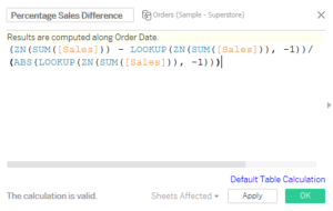
Step 1: In the Sample super store data set create a calculated field to calculate the % difference of sales wrt the previous time as under :

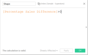
Step 2: Create a calculated field to assign the two shapes ( Positive Value and Negative Value )

Step 3: Drag segment into Rows , Order date into Columns .
Step 4: Select the Marks type to Shape. Hide the year 2013.
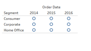
Step 5: Drag the created field Shape on to the Shape mark. Your Screen should now look something like this:

Step 6: Drag the calculated field to colors mark .
Step 7: Click on the shape icon and select the shape of filled upper arrow for True and filled down arrow for False.
Step 8: Change the color of True to green and False to red.
Step 9: Set the view to be Entire view from the toolbar.
Step 10: Bring Percentage Sales difference to labels .
Adjust the labels , format the chart area and you have your up down arrow chart.
Hope you guys followed and enjoyed it.
Thanks.
Rahul Singh
