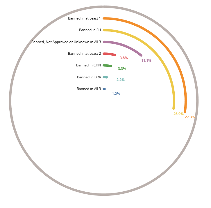
In this blog I will walk-through the steps of creating Tableau Rings. For the Makeover Monday Challenge ( those who do not know about the #makeovermonday challenge , you can find all the details here ) we had a data-set showing pesticides banned in rest of the world but used in USA. I decided to represent this data in the form of tableau rings and this is how it came up.
Since the starting this year we have been discussing about radial charts. If you have yet not gone through the bog , I would request you to have a look into these ( Radial Chart for time Series Data, Circles With Common Base and Circular Calendars ) and give these charts a try with a dataset of your own.
Tableau rings are a great way to represent percentage value. The chart had its limit that anything beyond 100% can not be represented on it. It is thus wise to use it show the percentage distribution of a metric across some dimension rather than the raw metric values as the metric value could very well go beyond 100.
Before we start this blog I would like to thank Toan Hoang for all the work that his does for the community. Here is the link about circular rings on `his blog. Do check out his course on Creating Bespoke Data Visualization in Tableau if you would like to learn about Advanced Data Visualization.
So lets start going and look into how do we create a Tableau Rings ??
We will start with a simple set of data where we would have the sales across some states and then we are going to represent the percent contribution to sales by these states .
Here is what the sample data looks like.
| States | Sales |
|---|---|
| Hyderabad | 546 |
| Mumbai | 7688 |
| Delhi | 2300 |
| Banglore | 13222 |
| Kolkata | 12000 |
| Chennai | 4355 |
| Pune | 34000 |
| Total | 74111 |
Step 1: The first step to create the chart is data densification ( a process in which we try to blow up the data to fill in extra rows ). We will duplicate this dataset and add a column for path with values 1 and 360 for the two sets. Also we would be adding a column for the percentage value that we would like to represent on the chart for these states. Here is what your final data should look like after the addition of rows and columns.
| State | Sales | Percentage Sales | Path |
|---|---|---|---|
| Hyderabad | 546 | 1% | 1 |
| Mumbai | 7688 | 10% | 1 |
| Delhi | 2300 | 3% | 1 |
| Banglore | 13222 | 18% | 1 |
| Kolkata | 12000 | 16% | 1 |
| Chennai | 4355 | 6% | 1 |
| Pune | 34000 | 46% | 1 |
| Total | 74111 | 100% | 1 |
| Hyderabad | 546 | 1% | 360 |
| Mumbai | 7688 | 10% | 360 |
| Delhi | 2300 | 3% | 360 |
| Banglore | 13222 | 18% | 360 |
| Kolkata | 12000 | 16% | 360 |
| Chennai | 4355 | 6% | 360 |
| Pune | 34000 | 46% | 360 |
| Total | 74111 | 100% | 360 |
Step 2: Once we have the data in the above format let us import it in Tableau and then create the following calculations.
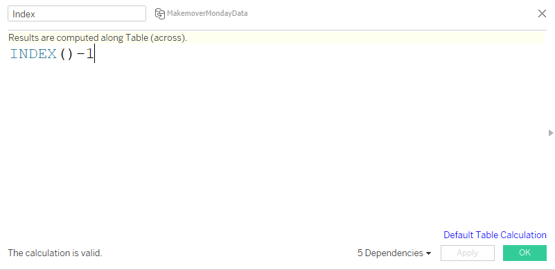
Index:
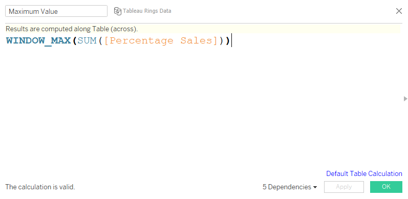
Maximum Value
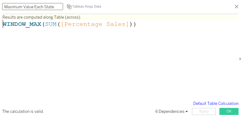
Maximum Value Each State
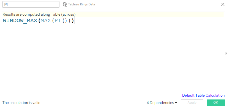
PI
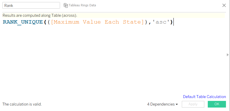
Rank
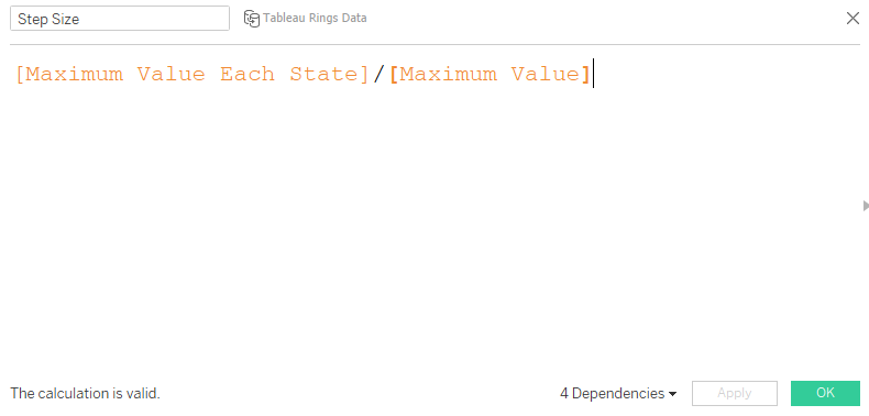
Step Size:
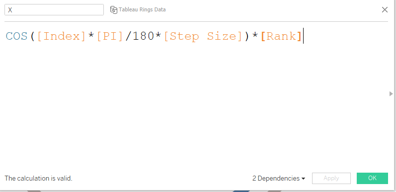
X
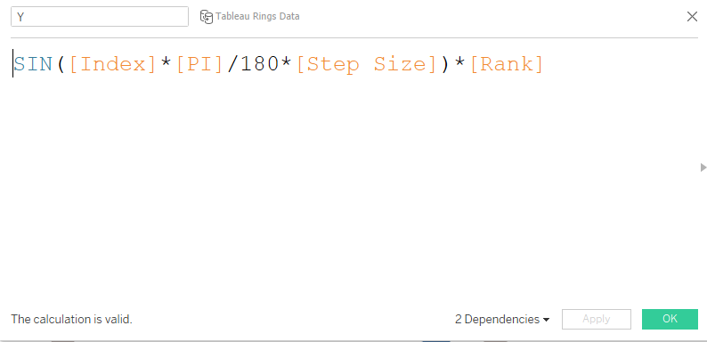
Y
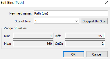
Right click on path and create Path Bin as under, make sure that the size of bins if 1
Step 3: Once all the calculations are in place ,bring the path bin to columns , right click on it and make sure that “show missing values” is selected. Bring this feild to details mark.
Step 4: Drag Y to columns and X to rows. Compute each of these using Path Bin. Your screen should have the following view now
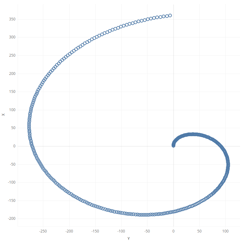
Step 5: Next change the mark type to lines and drag Path Bin on path. Bring states on to detail.
Step 6: At this point we need to edit the nested calculations for both X and Y . Right click on X and click on Edit table calculations. Under the nested calculation select the Maximum Value form the dropdown and edit the calculation as under
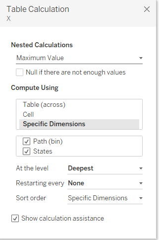
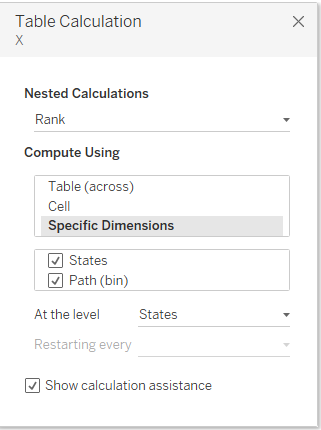
Perform the similar thing on Y and there you go , you will have your tableau rings ready.
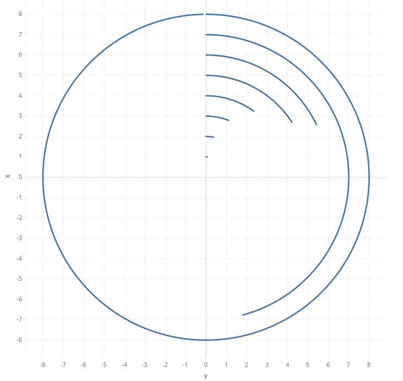
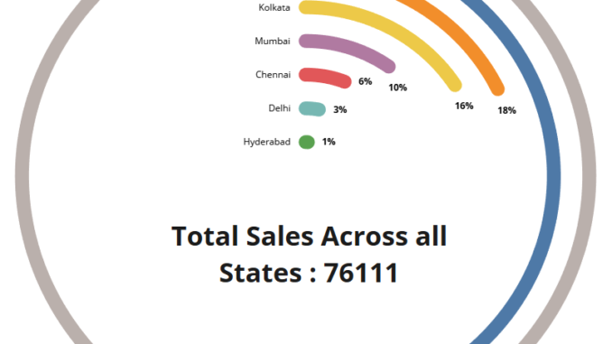
The outer ring represents the total ( 100% ) and the inner rings represent the states. Add states to color labels and format your chart as usual.
What Next
What if you want to use the same data but use only 3/4th of a circle ??
In that case you can assign the path value as 270 instead of 360 and remove total from the state feild. In that case your data set would be as under
| State | Sales | Percentage Sales | Path |
|---|---|---|---|
| Hyderabad | 546 | 1% | 1 |
| Mumbai | 7688 | 10% | 1 |
| Delhi | 2300 | 3% | 1 |
| Banglore | 13222 | 18% | 1 |
| Kolkata | 12000 | 16% | 1 |
| Chennai | 4355 | 6% | 1 |
| Pune | 34000 | 46% | 1 |
| Hyderabad | 546 | 1% | 270 |
| Mumbai | 7688 | 10% | 270 |
| Delhi | 2300 | 3% | 270 |
| Banglore | 13222 | 18% | 270 |
| Kolkata | 12000 | 16% | 270 |
| Chennai | 4355 | 6% | 270 |
| Pune | 34000 | 46% | 270 |
And when you perform the above steps your chart will look as under:
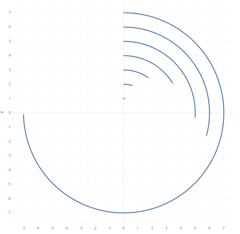
Here the longest arc represent the state that had highest sales ( Pune in our case ).
Hope you guys enjoyed reading it through and I am exited to know how you utilize these charts for your dashboard. Connect with me and learn more exciting stuff to come .
Happy Learning !!
