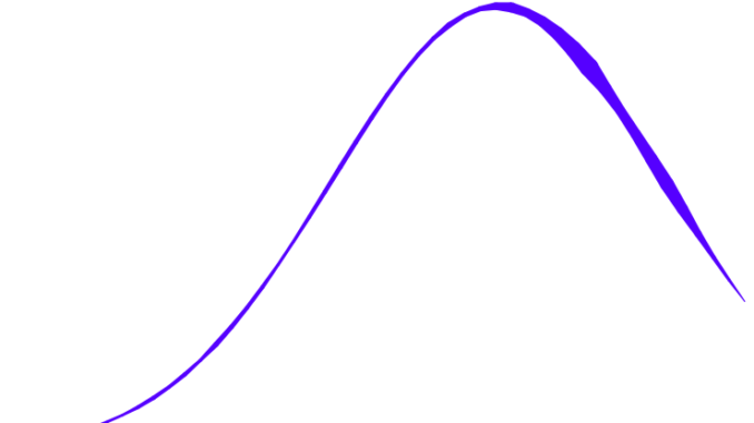
In the last article of advanced charts we discussed about how to create a scatter pie plot in tableau. Today we will discuss an interesting chart – fitting a Bell Curve to our histogram in Tableau. The bell curve is the most common type of distribution for a variable, and due to this fact, it is known as a normal distribution. The term “bell curve” comes from the fact that the graph used to depict a normal distribution consists of a bell-shaped line. The highest point on the curve, or the top of the bell, represents the most probable event in a series of data, while all other possible occurrences are equally distributed around the most probable event, creating a downward-sloping line on each side of the peak.
Now as we have a understanding how a bell curve is lets try to built it in tableau . To build a bell curve we will use the World Indicators data .
Lets get going and fit a bell curve to our female life expectancy values from our World indicator dataset.
The first step is to create a parameter for the female life expectancy value. We will fix the value if the parameter to be one.

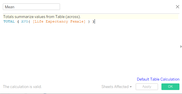
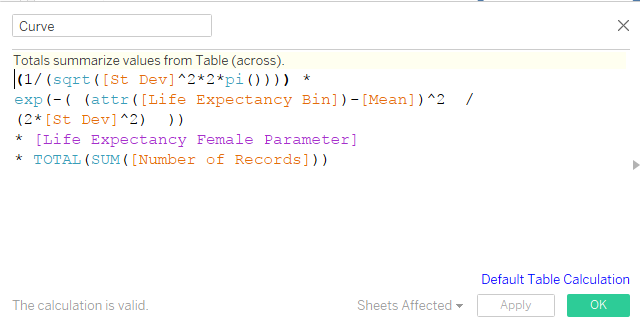
Once we have created a parameter for the life expectancy female measure we will have to create a calculated field for creating the Life Expectancy Bin, average life expectancy, standard deviation of life expectancy and the field for bell curve as under:


Once we have created the required field , move the Life Expectancy bin to dimension. Exclude the null values from the view.
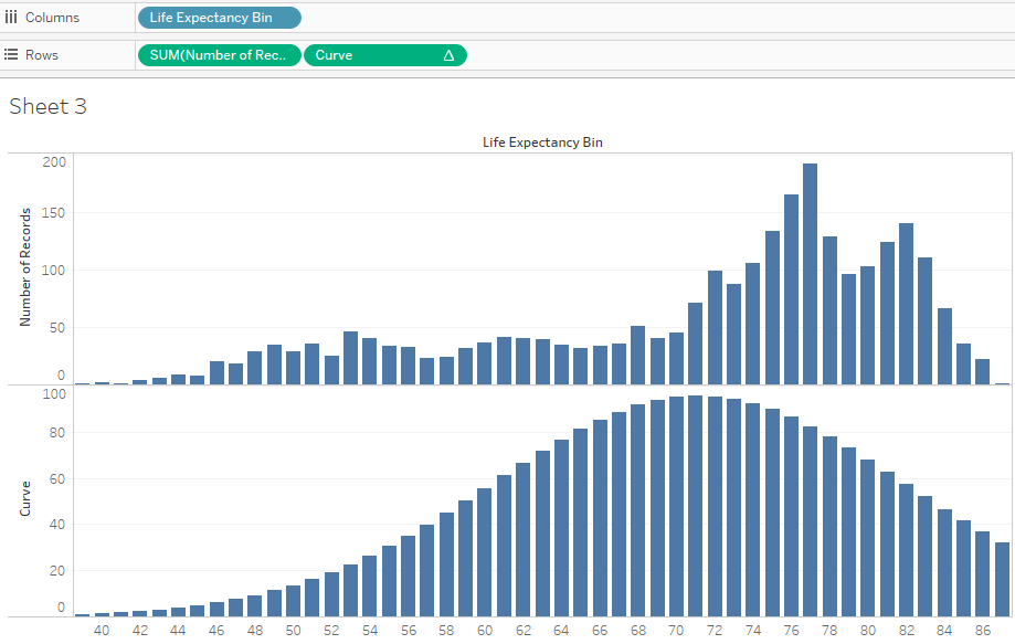
Drag the Life Expectancy Bin to Column shelf. Drag the measures Number of Records and Curve to the rows. Your worksheet will now look as under:

We can now see the curve in the view. Select Curve in the rows shelf and from the marks card select line. Right click on the Curve measure and select Dual axis.
Our bell curve is now ready and sits beautifully on the Life Expectancy Female histogram.

Hope you guys enjoyed the post.
Let me know if you are not able to follow any of the steps.
References: Robin Keneddy
