
The previous article in the series highlighted the steps to create a waterfall chart in Tableau. Today we will discuss about a interesting chart in Tableau : Combination of scatter plot and a pie chart , a scatter pie chart. Sounds interesting , Right ?
Lets go ahead and do this using our standard dataset – Sample Superstore Data.
We will try to plot the sales and profit on the scatter plot and then try to split each circle in a pie with three marks for Categories. To achieve this we will use LOD calculation in Tableau . To understand more about LOD refer to the article here .
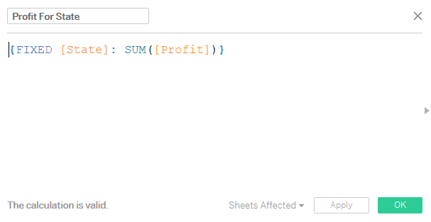
Step 1: Create a calculated field to calculate the sales and Profit across states.

Step 2: Drag the measure Sales for State in the Columns Shelf and the measure Profit for States in rows shelf.
Step 3: Drag state into the detail Shelf and change the mark type to pie. Bring the measure Sales for State to size. Increase the size and your worksheet will now look like this:

Our job in now almost done. Add Category to the colors pill and the measure Sales to the Angle pill. There we go , our Scatter pie chart is now ready 🙂

A more interactive version can be found in the workbook here :
Hope you guys enjoyed reading this article.Comments are appreciated.
References: Namrata Sawant
Jonathan Drummey