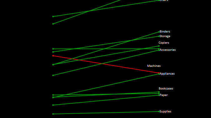
In this blog of advance charting we are going to discuss about how to build slope charts in Tableau.
A slope chart is used when we are comparing a measure across two dimension , lets say we want to see how the sales of subcategories were for two years , if they increased or decreased by the means of a line chart , which has a positive slope if the sales increase and a negative slope if it decreased.
Lets get going and try to create a slope chart using our Sample superstore data.
Create a Calculated field that gives us the sales for 2014 as under:

Similarly create a calculated field that gives us the sales of 2015 as under :

Drag measure names to the filter shelf and select Sales 2014 and Sales 2015

Drag measure names to the Columns Shelf and measure values to the row shelf. Change the Mark type to line .
Bring Subcategories to the detail marks . Our slope graph is now ready.

You can refer to the following workbook for more info :
Hope you all enjoyed the post. In the next post on slope charts we would discuss how to add vertical lines to the slope charts.
