Hi All,
In this blog I am going to take you step by step to create a waffle chart.
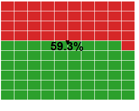
A waffle chart is the best way to show percentage values.
Following is what a waffle chart looks like
Step 1 : The first step to create the waffle chart is to get the excel file ready for the waffle . The excel file has the following three columns : Rows , Columns and Percentage . Following is the format of the excel file :
Step 2: Import the excel file into tableau. Bring Rows and columns from measures to dimentions.
Step 3: Bring the column variable to the column pane and the row variable to the row pane.
Step 4: Add a measure Avg(1) in the columns pane and in the marks select bar. Resize the bars to form the base of the waffle chart.
Step 4 : Sort the rows in descending order.
Step 5: Connect the data file whose percentage is to be shown in the waffle chart (Sample.xlsx in this case).
Step 6: Create a calculated field for the color of the waffle chart
Step 6 : Add the created field to the colors mark . Format the charts and you waffle is ready .


