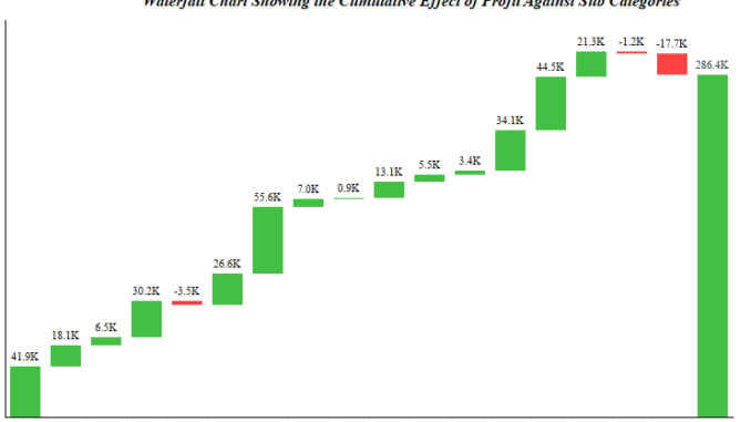
In the last article under Advanced Charting we discussed how to create Rank Charts in Tableau . Today we will discuss about how to make Waterfall charts in tableau . A waterfall chart is a form of data visualization that helps in understanding the cumulative effect of sequentially introduced positive or negative values.
We will use the Sample superstore data. In this data lets try to see how the subcategories have contributed to the overall profit in a year.
Step 1: Drag Sub Category to the columns and Profit to rows.
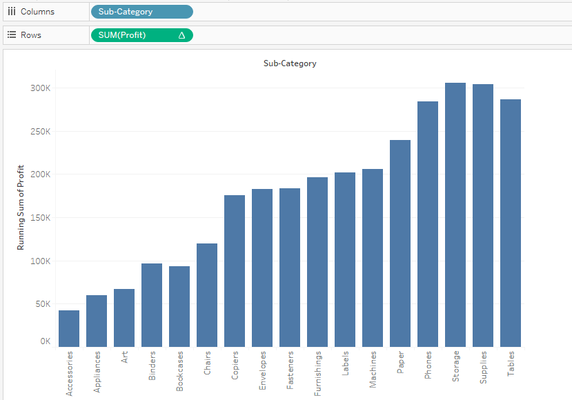
Step 2: Right click on the Profit measure in rows and from the dropdown select Quick table Calculations>> Running total. Your worksheet will appear like this:

Step 3: Create a calculated field for Negative Profit.

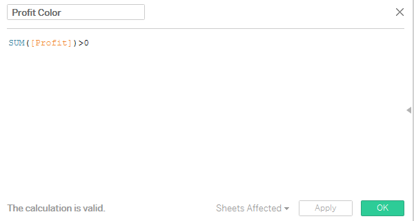
Step 4: Create a calculated field to differentiate between positive and negative profir .

Step 5: Select gannt bar from the marks card and drag the measure negative profit to the size.
Step 6: Click on the Analysis button on the menu bar and in the dropdown select Show Row totals. Bring the calculated field in the colors mark and your waterfall chart is ready.
We can clearly see how each subcategories contribute to the total profit. In our case Bookcases, Supplies and tables are the three subcategories that are bringing the profit down.
Hope you guys enjoyed the post.
