
In the previous article under this series we learnt about average lines for entire table and per pane . Today we will continue our discussion with Average line per cell. Average line per cell are used to compare the value of each cell to a specific value.
Lets build up a viz in tableau and try to explore more about this.
Create a calculated field to compute the Sales for the year 2015 and 2016 as under :


Drag Sub Category to Rows and Sales 2015 to the columns . Place Sales 2016 in the Details mark. You will have the following view now:

From the analytics pane select Average line and drag it to the worksheet . Place this in Per Cell region this time. You will see a small line at the end of every bar ( for each sub category ). Right click on this >> Select Edit and the pop up window will appear as under :
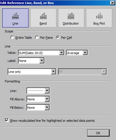
In the line area Select SUM(Sales 2016) from the dropdown. Format your worksheet and you will have a view similar to this now:

Above we can see the bars are the average sales for Subcategories in the year 2015 and the reference line against each bar shows the average sales of Sub categories in the year 2016. This makes these two values easily comparable. It is more similar to Bullet Graphs which we have already discussed earlier here.
To swap the lines simply right click on the axis and select Swap Reference Line Fields.
Below is a worksheet you can have a look at where I have used the concept as discussed above. Note how I have colored the bar as Red and Green ( red if the sales value in 2016 is less than that of 2015 ) . Try to create this and let me know if you are not able to achieve it.
Thanks.
Rahul Singh