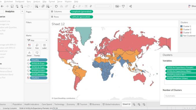
Clustering is grouping similar observations or data points of similar measures. Clustering helps our daily businesses in many ways. Let’s see an example, there are a group of people who want to buy a car which is under 6000$ and is small in size belong to one cluster, another cluster of people want to buy a car which is more than 30,000$ and is bigger in space and size. It helps car manufacturers to identify the demand and produce accordingly with new models if necessary.
Tableau provides clustering analysis using K means model which uses centroid approach in finding clusters. This model divides the data into k segments with a centroid in each segment which is a mean value of all points in that segment. Objective of this algorithm is to place centroids in segments such that their total sum of distances between centroids and points in their segments is as small as possible.
We can use clustering in many ways and apply it in various scenarios. Here I am going to demonstrate some of the applications of it using Tableau. To get started download the dataset from this link.
Let’s get our hands dirty!
Examine the data-set, it contains data about different features of the flowers. Load dataset into tableau as shown below. After loading the dataset go through the features loaded.
If we see the dataset, it contains data about features of 3 species of flowers. Now let’s plot a visualization between petal width and length. Just drag and drop the petal width and length onto rows and columns as shown below.
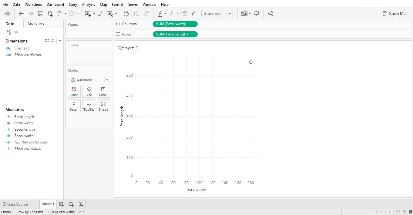
Here we see that there is only one data point as tableau by default aggregate measures. You can make it reverse by just with a click as shown below.

Just go to analysis tab in the menu and un-tick the aggregate measures option.
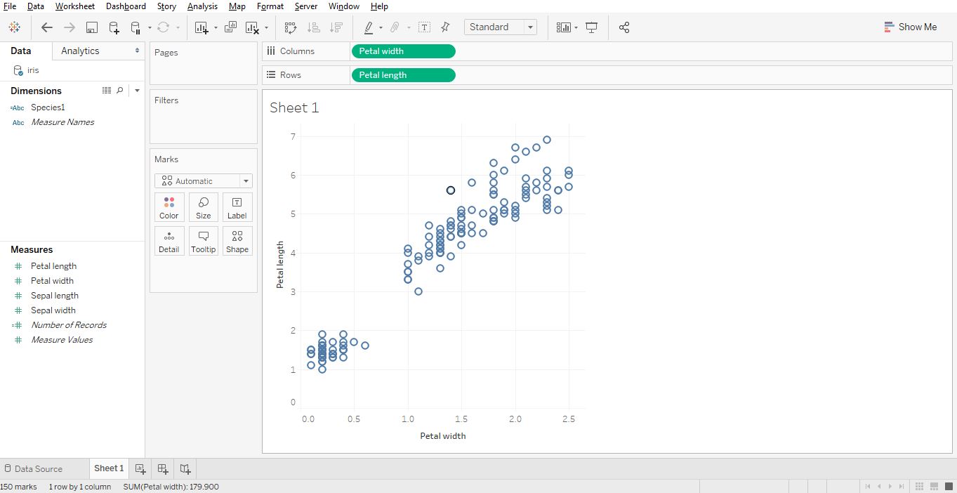
Here we can see a scatter plot between two measures. Now we are going to cluster these data points according to their species. To do that just go to analytics menu as shown below.

Just drag and drop cluster option on to plot to make clusters.
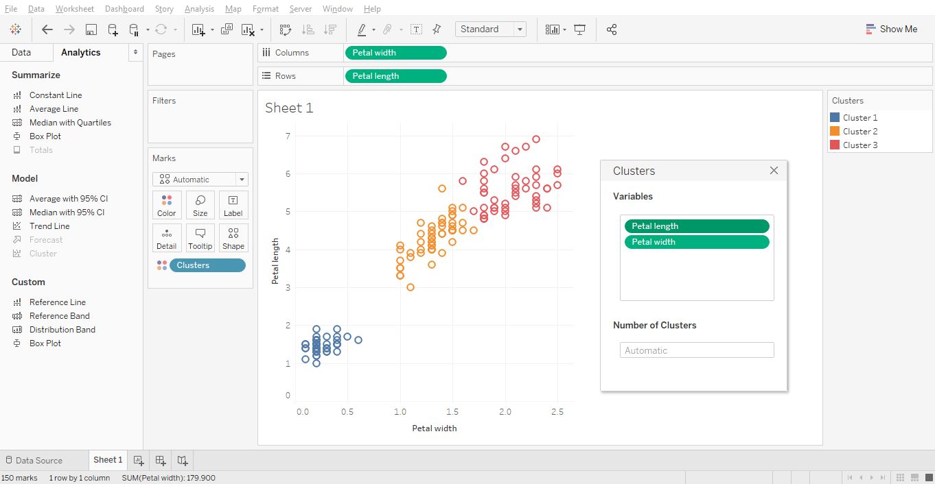
Here we get clusters automatically. Tableau provides an option to change number of clusters we want and which variables should be used to make clusters. Tableau automatically uses the fields in the view to make initial clusters.
We can change which variables should our clusters consider by just simply dragging and dropping as shown below.

Here clusters are made but we want to know on what statistical model and values these clusters are made. Tableau provides an option to know how these clusters are made as shown below.

By just clicking on that describe clusters option we will get a new window with summary and model description which shows us some statistical values used in the model.

Based on these summary we get to know about values used in model to make clusters. Now explore models tab to know what information it provides.

If we see here there are two important metrics F-statistic and P-value which helps us to decide difference between two clusters.
F-Ratio:
F-Ratio is a statistical ratio which is used to analyze if the expected values of a variable within groups differ from one another. It is the ratio of sum of squares (variances) in other words.
F= Between Group Variability/Within Group Variability
The greater the F-statistic, the better the corresponding variable in distinguishing between clusters.
P-Value:
If we perform hypothesis testing in statistics, P-value helps you determine significance of your results. The p-value is the probability that the F-distribution of all possible values of the F-statistic takes on a value greater than the actual F-statistic for a variable. If the p-value falls below a specified significance level, then the null hypothesis can be rejected. The lesser the p-value, then more the expected values of the elements of the corresponding variable differ among clusters.
Tableau provides an option to save formed clusters into a group and used further as shown below. Just drag and drop cluster option with colour in marks pane to dimensions to save it as group.
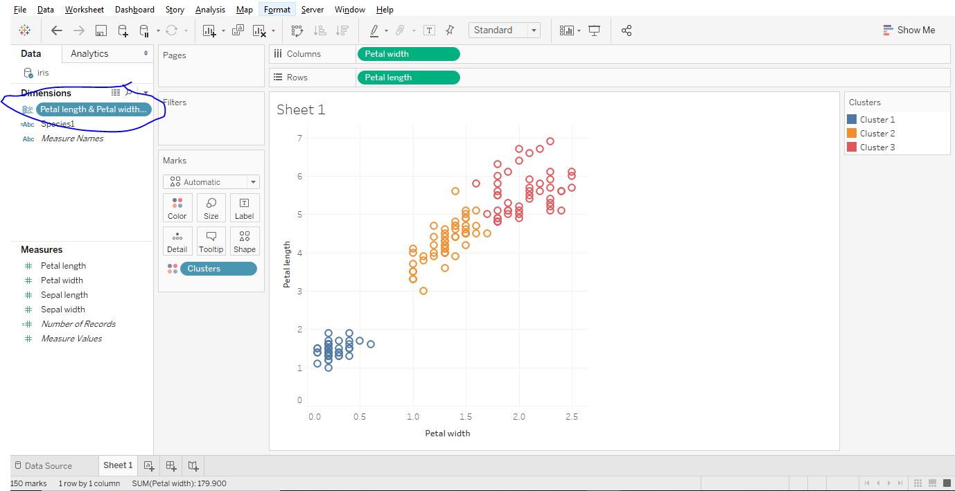
Tableau doesn’t allow using some fields in clustering as mentioned below:
- Dates
- Bins
- Sets
- Table Calculations.
- Blended Calculations.
- Ad-hoc Calculations.
- Parameters
- Generated Longitude and Latitude Values.
Let’s see another example using World Indicators data set which comes default with Tableau. Just open the sample workbook named World Indicators default with tableau and explore the data, it consists data about various indicators of all countries in the world. Just go to a new sheet to make clusters using this data. Here I made a visualization using different measures on a map as shown below.
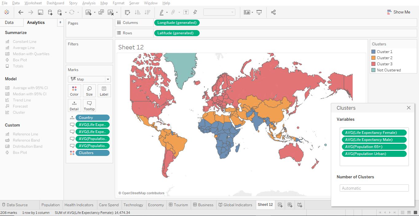
You can try different variables to make clusters. If we see model description of clusters we can grasp various things about different countries based upon their clusters.

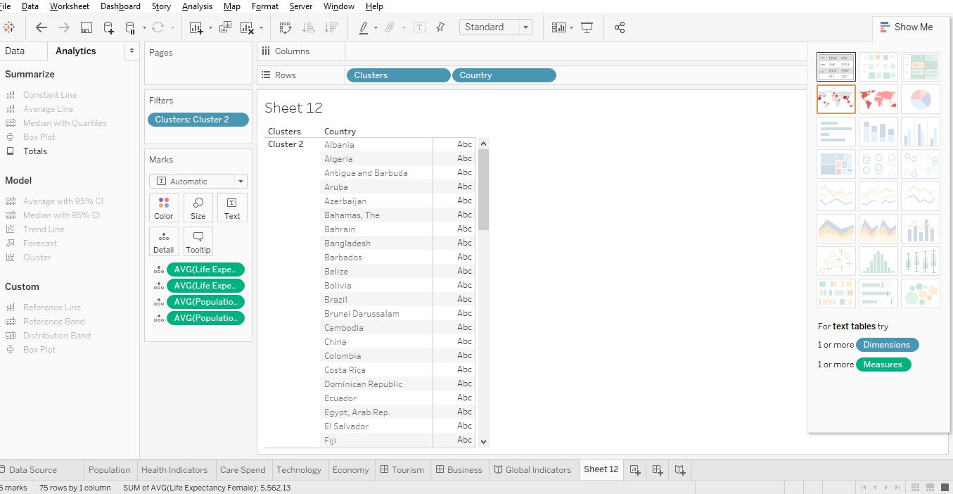
Here it shows average life expectancy, average population above 65 years and urban population which helps in determining various scenarios about particular cluster. We can see which countries lies in each cluster as shown below. Select any one cluster and go to show me and select text table to view names of countries present in that cluster.
Conclusion:
Here in this article I have shown only few scenarios of clustering and how it helps us in taking decisions. But main thing in clustering is observing the clusters formed and using according to requirement. Keep exploring by using different types of data sets. To be better keep practicing. Keep Rocking!
“Happy Clustering!!”
Author Bio
This article was contributed by Perceptive Analytics. Juturu Pavan, Prudhvi Sai Ram, Saneesh Veetil and Chaitanya Sagar contributed to this article.
Perceptive Analytics provides Tableau Consulting, data analytics, business intelligence and reporting services to e-commerce, retail, healthcare and pharmaceutical industries. Our client roster includes Fortune 500 and NYSE listed companies in the USA and India.
