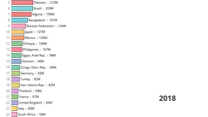
In this blog we will learn how to use the latest feature in Tableau to create a race bar charts. Race bar charts are the best option when we need to show how a metric has changed over time across multiple places.
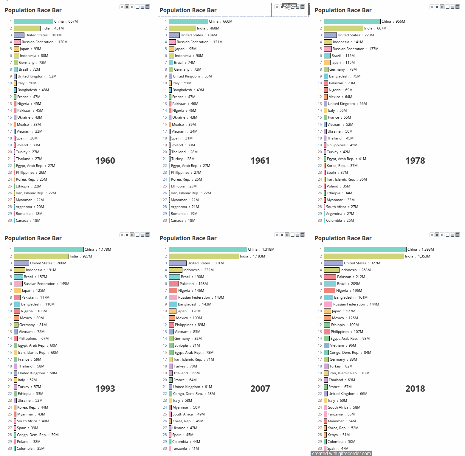
A scenario for race bar charts could be showing the population across different countries across time-period and then visualizing how some counties are climbing up the ladder and becoming more and more populous over time.
Lets try to create a race bar chart for population across countries step by step.We will be using tableau public version 2020.1 for this.
Step 1 : Import the data in Tableau. You can download the data from here.
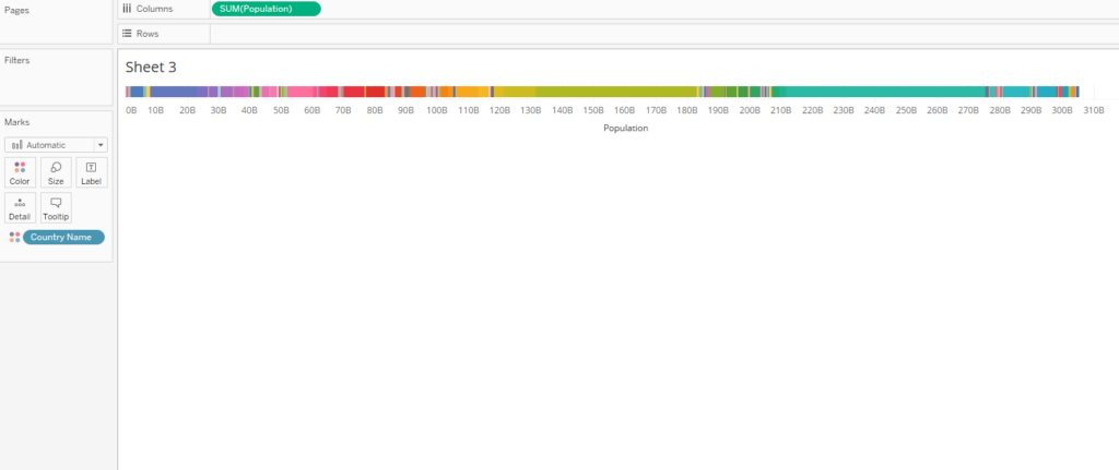
Step 2 : Drag population in columns and countries in the color mark. Your view will now be somewhat like this:
Step 3 : Now let’s create a Rank calculation to calculate the rank on the basis of the countries population as under
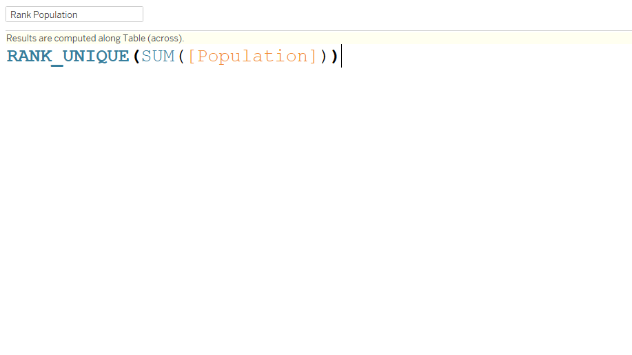
Convert this calculated field to discrete and bring it on to rows . Right click on the Rank Population field and compute it using country.
Step 4: Place the year field on the pages shelf and you will see a control to navigate the years as under:
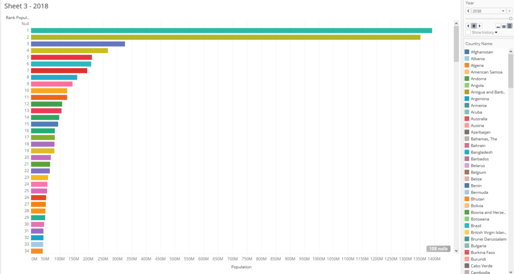
Now once you click on the play button you can see the race bar in actions and see how countries have become populous with the advance in years.
Here is an interactive version of the population race bar that we created.
Hope you guys found this tutorial useful . Let me know in case you are not able to replicate any of the steps.
Happy Learning!!
