
In the previous blog of the series Tableau Charts we discussed about Area Charts. In this blog we will discuss about a very powerful chart type in Tableau : Dual Axis Charts.
Dual axis charts are the most powerful chart option that we get in the Show me tab. Its similar to the dual axis that that we use in excel. They are used when we want to see two measures on the same chart but with different axis.
So lets go ahead and create a dual axis chart using the Sample Superstore data.
Step 1: Drag Order date to the Column shelf. Right click on the date pill and select month option that appears second in the dropdown.
Step 2: Drag sales to Rows .
Step 3: Drag profit to Rows along with Sales. Right click on the profit pill and select Dual Axis.
Step 4: Click on the profit axis and select Synchonise axis.
Step 5: Select the sales pill and change the mark type to bars. Our Dual axis chart is now ready :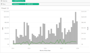
The values in the bar represent the monthly sales across time on the left axis and on the right axis we have the monthly profit represented by line chart.
I hope you guys are having fun with all these tutorials .
Comments are always appreciated .
Thanks.
Rahul Singh