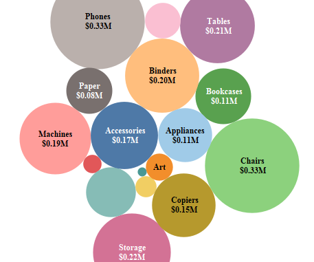
In the previous blog we discussed about Bullet Graphs. In this blog under the series Tableau Charts we will talk about Packed Bubbles . Packed bubbles are similar to tree maps . To create a bubble chart in tableau we need to have one or more dimension and maximum of two measures. The size of the bubble represent the magnitude of the chosen measure and the color of the bubble may either represent the second measure or the dimension.
Lets create a bubble chart and take a look into it.
To create a bubble chart select Sub Category and Sales from our Superstore dataset and under the show me tab , select on packed bubbles. Drag Sales to the labels mark.
This is how your screen should look like now:

We can see that the sub categories are plotted in the form of bubbles where the size of the bubble is proportionate to the Sales of the subcategory.
Bubble charts are generally not used much as they consume a lot of space and are sometimes difficult to interpret .
You can go ahead and try different combinations for bubble chart and see what you come up with.
