
In this blog under tableau tip we are going to discuss about applying conditional formatting to individual measures . Remember how in the last article we applied conditional formatting to a single measure across multiple dimension. This time we will do it on individual measures.
We will be using our same super store data for this as well.
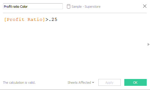
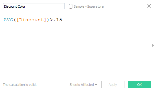
Let say we wan’t to apply conditional formatting to our discount and profit ratio measure across sub categories. Profit ratio more than 25 % are formatted green and those less than 25% are formatted red. On the other hand in the same report , Average Discount more than 15% is formatted green and red else-wise.
To do this we need to create two individual calculated field for these measures as under:
Next we need to create two placeholders (dummy axis) on which we can place the two measures and format them. This is done as under:


Once done place the measures Profit Dummy Axis and Discount Dummy Axis on Columns side by side. Drag Sub Category to the rows and form the marks card select bar . Resize the bar in the worksheet and your sheet will now look as under:

Click on the Profit Dummy Axis on the columns and on the color marks place the calculated field Profit ratio Color. Similarly click on the Discount Dummy Axis on the columns and on the color mark for this place the calculated field Discount Color.
For both of these change the color for true as green and red for false. Your worksheet will now be formatted and will look as under:

Here we go . Lets go a step further and add values to the cell along with a up symbol for true and a down symbol for false . We would also like to have the up/down arrow to be colored as green/red respectively.
To do this we need to create different fields that would assign these arrows according to our condition. I will do it for Profit and leave the discount one to you guys to do.
Here’s how to do that. Create two calculated field as under :


The up/down arrow symbol can be generated by pressing the ALT 31 together for down and ALT 30 for up arrow.
Click on the Profit dummy axis measure on the Columns and place Profit Ratio, Profit Ratio Down Symbol and Profit Ratio Up Symbol to the labels mark.
Now click on the Labels mark and then select Text under Label Appearance. This will open the window to Edit the label as under:

Align all these into a single line and change the color of <AGG(Profit Ratio Down Symbol)> to red and green for the up one. Your edit label box will look as under:

Hit on apply and and align these labels to center. Click on the colors mark and decrease the opacity to 50%. Your KPI’s will also now be visible in the cells as under:

I have left adding KPI to the Discount measure for you guys to try out. Do let me know in case if you are not able to get it.
Hope you guys enjoyed the post.
Wow!!!!Thank You for this
Hi Rahul , Can you please make a post on tableau javscript api integration with examples.Step by Step.Soory if I’m asking too much.Just a curious Tableau Guy
Hi Manoj, thanks a lot for your suggestion. I will definitely look into this and try to post it. Thanks again for your time!!