
Hi All,
In this blog of Advanced charting series we will take a look into how to build a quadrant chart in tableau . A Quadrant chart divides the chart area into four quadrants : High-High , High-Low , Low-High and Low-Low.
To create a quadrant chart in tableau we will have to divide the chart area into 4 regions based on the measures value we have selected on X and Y axes.
Let move forward and create a Quadrant chart in tableau.
The basic requirement for a Quadrant Chart is a scatter plot . A scatter plot is a chart type in which two continuous variables are represented on two different axes.
To create a Scatter plot lets bring Discount in columns and Sales in Rows (used sample superstore data) . Select the default aggregation to average.
Bring Customer name to Detail.
Now lets go ahead and divide this scatter plot into 4 quadrants . To consider the values for the Quadrants we will consider the average of Sales and average of Discount.
Create a calculated field as under :
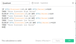
Here I have taken as the Average discount value to be 16% and average sales per customer to be $228.
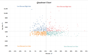
Bring this calculated field into colors mark and your quadrant chart will be ready.
Format the chart area to bring up the labels and mark
Hope you guys followed it. Do let me know if this is not clear .
Thanks.
Rahul Singh
please update on AXIS RANGE what we have to set for both (Discount & Sales) as it is not clear in image.
These text “More Discount High Sales” / “More Discount Low Sales” are annotate or what. Please update me on this too.
Hi Sachin,
The axis range are the default range that comes up when you plot the scatter plot between Discount and Sales. The text “More Discount High Sales” / “More Discount Low Sales” are actually the quadrant labels the font of which have been matched to quadrant color. Hope I am clear on this. Let me know if you are unable to follow.