
A sparkline is a very small line chart, typically drawn without axes or coordinates. It presents the general shape of the variation (typically over time) in some measurement, such as temperature or stock market price, in a simple and highly condensed way.
In this post we will see how to make a sparkline graph in tableau . We will be using the same sample superstore data.
Lets get started and create a sparkline graph step by step :
Step 1: Drag Order date to Column . Right click on the order date and select Month that appears second in the dropdown.
Step 2: Bring Sales to Rows.
Step 3: Go to edit axis and in the edit axes box uncheck Include zero option and Select Independent axes ranges for each row and column .

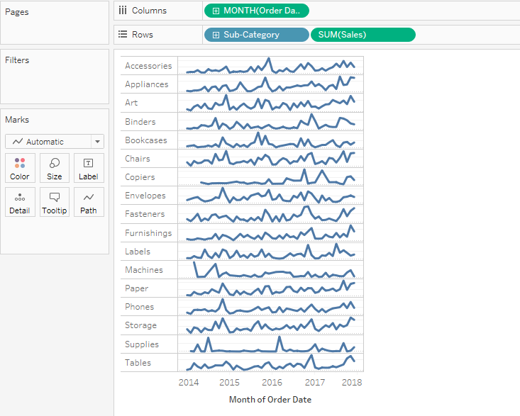
Step 4: Bring Subcategories to rows in front of Sales . Right Click on the sales measure in the Rows and unselect the Show header option.
Resize the view and your sparklines are ready.
There a lot you can do to your sparkline like show the minimum and maximum values . Along with the sparklines you can have the KPI’s side by side in the same view.
Try it out and let me know if you have any issues.
I will be glad to assist.
Hope you guys enjoyed this. Keep visiting regularly for more interesting stuff to come. Until the next time happy tableauing.