
What is correlation?
Correlation is a statistical measure that indicates the extent to which two or more variables are related. The measure of correlation between two variables is called correlation coefficient. Pearson’s correlation coefficient is one of the most widely used and measures only the linear correlation between two variables, while the other correlation might also measure non linear relationship.
Types of Correlation:
The value of correlation coefficient ranges from -1 to 1 .On the basis of the values of correlation coefficient we have three types of correlation:
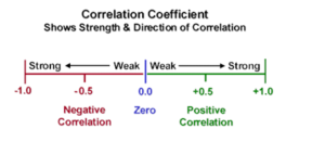
1- Negative Correlation: Two variables are said to be negatively correlated if the value of the correlation coefficient is between 0 and -1. A few examples of negative correlation are:
- If the sun shines more, a house with solar panels requires less use of other electricity.
- The more one works, the less free time one has.
- As the slope of a hill increases, the amount of speed a walker reaches may decrease.
2- Zero Correlation: two variables are said to be not correlated if the value of correlation coefficient between them is 0.
3- Positive Correlation: Two variables are said to be positively correlated is the value of the correlation coefficient is between 0 and 1. A few examples of positive correlation are:
- The more hours you spend in direct sunlight, the more severe your sunburn
- As a child grows, so does his clothing size
- As the slope of a hill increases, the amount of speed a walker reaches may decrease.
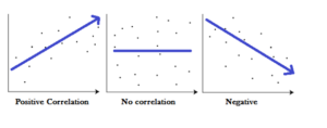
Positive , Negative and No Correlation on a Graph:
Benefits and Practical Use Of Correlation:
There are several advantages of correlation, the first being it is simple to calculate and easy to interpret. It also helps us in making predictions.
On the other hand we need to bit a bit cautious while using correlation. The value of the correlation 0 implies that there is no linear relationship between the variables, however there could be some non linear relationship between the variables. Secondly correlation could be spurious in nature as well. There may be a high correlation between two variables still their relationship would not make any sense. For example there may be a positive correlation between height and income of individuals, however this seems quite illogical.
Correlation And Causation
Correlation is, “A statistical measure (expressed as a number) that describes the size and direction of a relationship between two or more variables. While causation “Indicates that one event is the result of the occurrence of the other event; i.e. there is a causal relationship between the two events. This is also referred to as cause and effect.” The classic causation vs correlation example that is frequently used is that smoking is correlated with alcoholism, but doesn’t cause alcoholism. While smoking causes an increase in the risk of developing lung cancer.
Correlation In Tableau:
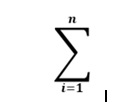
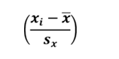
The classical formula to determine the correlation between two variables is
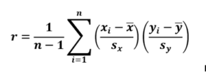
Here x and y represent the two variables, Sx and Sy represent the standard deviation of x and y . And n denotes the sample size. X bar and Y bar represent the mean of X and Y respectively.
To use this formula in tableau we will break the formula in four parts . This is how it is done:
The first part of the formula is denoted by
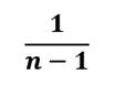
Which in the language of tableau can be written as 1/(SIZE()-1). The size function in tableau tells us about the sample size.
The next part of the formula is
Which is equivalent to the WINDOWSUM function in Tableau
The third part of the formula is
Assuming this be a measure profit in our data the formula can be rewritten as:
(SUM([Profit])-WINDOW_AVG(SUM([Profit]))) / WINDOW_STDEV(SUM([Profit])))
Similarly the fourth part of the formula can be written as we wrote our third part.
Lets go to tableau and use this formula for calculating the correlation coefficient.
Step 1: Build our View
Lets open our tableau workbook and use our default Data set “Sample Super Store” data.
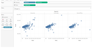
Once we have our data connected, drag the measure Sales to column and Profit to rows. Place Customer Name on the details mark. Drag the dimension Segment to column in front of Sum(Sales) which is already present in the column.
Your view will now be as under:
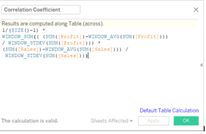
Let s go ahead and create a calculated field to compute the correlation coefficient as under :
Next drag this field to color and compute it across Customer Name. Our view will now be as under:
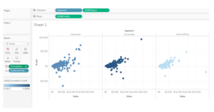
Here can see the colors of the dots for the three segments to be different. The color denotes the strength of the correlation coefficient. The darker the dots, the higher the strength of correlation.
We can also add reference lines and bring in other dimensions to see how the two measures are correlated in other dimensions.
Summary:
- The best way to measure the relationship between two continuous variables is through correlation.
- Correlation can be between -1 and 1
- The closer the value to -1 or 1 , the stronger is the correlation.
- Correlation is not causation.