
In the last blog in the series Tableau Charts we talked about Symbols & Filled Maps . Today we will talk about a most common chart type that we all use most often. Yes we are going to talk about pie charts and how to build them in tableau . A pie chart is used when we need to show proportion or percentage values across dimension. To create a pie chart we need one dimension and a measure. Let select Region and Sales from our Sample super store data and then in the Show me tab click on Pie Chart.
This is how a pie chart looks:
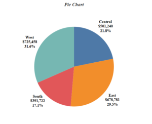
Though pie charts are the most common visualization we see , they are mostly done incorrectly . A pie chart should be used when a dimension has less attributes ( 5 to 6 ). If a dimension has more than 10 attributes , a pie chart may look cluttered and would not convey the message that we would want to give.
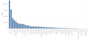
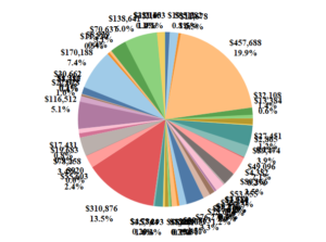
The above chart shows how a pie looks when we have more attributes under a dimension ( I have selected state here ) . We can hardly make any sense from the pie chart in this case , however a bar chart conveys the information more effectively in this case.
Hope you guys enjoyed this.
In the next article in this series we will discuss about Treemaps in Tableau.
Happy Tableauing till then.
Thanks
Rahul Singh