
In the previous blog we looked into Heat Maps & Highlight Tables . In tableau when we are dealing with geographic variable we have two options : Symbol maps and filled maps. We will look into both of these individually.
Symbol Maps:
To create a symbol map we need 1 geographical dimension , 0 to 2 measures . Lets go ahead creating a symbol map any try to interpret what it means. We will use the same sample superstore data again. Double click on the State Dimension . When we do this we can see a circle again all the states that are in the data. Now place sales on the size and in the color marks bring profit. The resulting view that we get is a symbol map . This is how it look like :
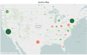
The size of the circles represent the volume of sales. The map shows us that maximum sales was in California state. The colors of the circle represent the profits in the corresponding state. Green color are for the states where profits are positive and red colors denote negative profit .
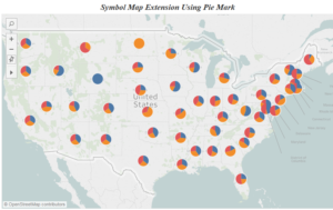
Symbol maps can be used differently . Here is a symbol map that shows the sales of categories in the states in the form of a pie map ( we will discuss pie charts in the next blog ).
Filled Maps:
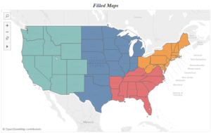
Filled map are a extension of symbol maps . To create a filled map just change the mark from circle to filled maps in the dropdown. Here is what is looks like:
Hope you guys enjoyed the post . In the next post we will talk about pie charts . Till then happy tableauing .
Thanks
Rahul Singh