Hi All,
In this blog of Tableau tips I will discuss how to highlight the top and bottom in a chart . Often we come across scenarios when we have to show the maximum and minimum value in our chart view . Let us consider our superstore data. If some one asks us to show the sales across the months for the complete data set its quite easy. We can easily construct a bar chart showing us the sales across all the months . These bars by default would be same in color ( until we apply some coloring scheme).
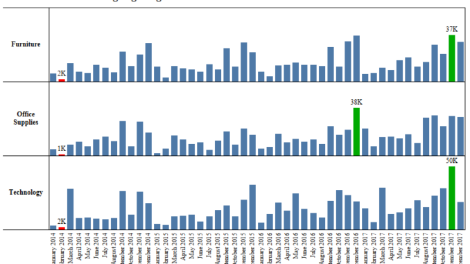
What if we are asked to show the bar corresponding to the month with highest sales as Green , the month corresponding to lowest month as Red and all other as Blue.
To do this we will would use the Window_Max and Window_Min function to identify the months with max and min sales respectively to create a calculated field.
Lets get going and see how we achieve it:
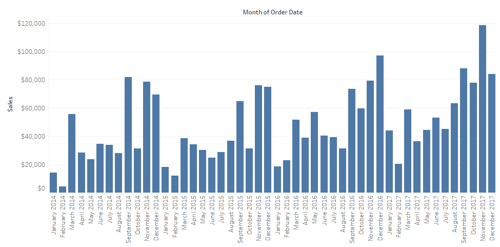
Step 1: The first step would be to create a view to show the sales across months. To do this drag the Order Date into the Columns Mark . Right click on the Order Date and select Month that appears second in the drop down. Drag sales to the Rows and select the marks as Bar. Your screen should look like this :

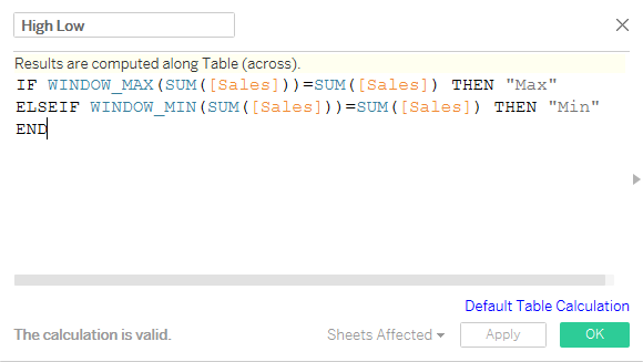
Step 2: To identify the minimum and maximum selling month create a calculated field High Low as under :

This calculated field compares each month sales value to the windows maximum ( maximum sales across all months ) and the windows minimum sales ( minimum sales across all months ) and assigns the value Max if the sales is equal to windows maximum and Min if sales is equal to windows minimum sales.
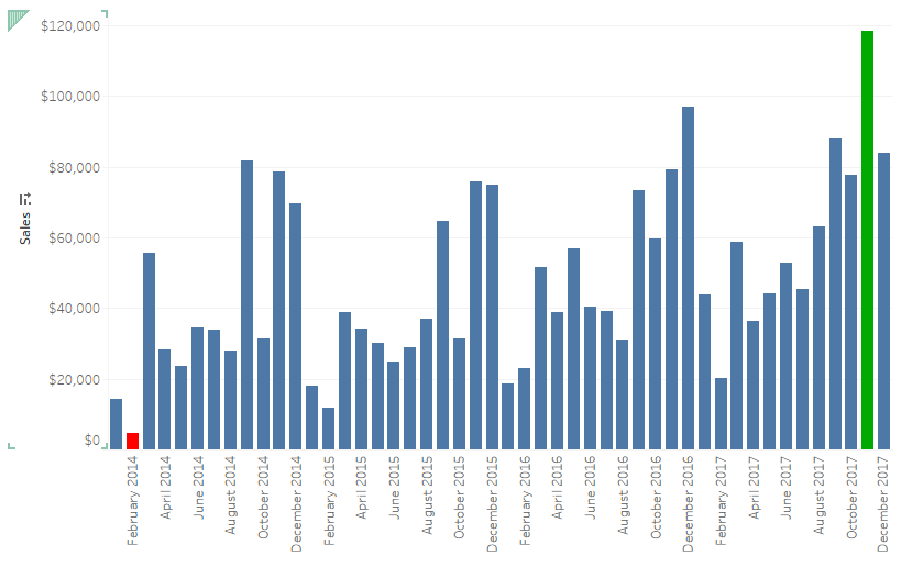
Step 3: Place the created field High Low on the color marks and there you go . Our bars are now colored differently for the maximum and minimum selling months.
You view should be somewhat like this:

Here we see that the highest sales corresponds to Nov 2017 ( Green ) and lowest sales corresponds to February 2014.
Hope you guys enjoyed the post and followed it. Ping back if you are not able to get this.
