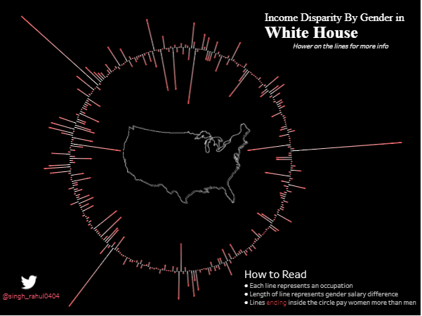
This visualization tells us about the Pay Gap between male and females for the same position in White house. Lines which are inside the circle represents Position in which females were being paid more than males and lines outside circles represent position in which males are being paid more.
Check out this cool viz at : White House Salary Gap.
Please follow and like us:
