
White House Salary Gap By Gender
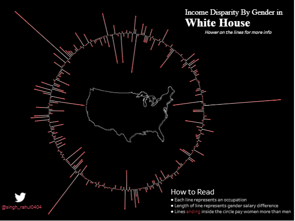
This visualization tells us about the Pay Gap between male and females for the same position in White house. Lines which are inside the circle […]
This visualization tells us about the Pay Gap between male and females for the same position in White house. Lines which are inside the circle […]
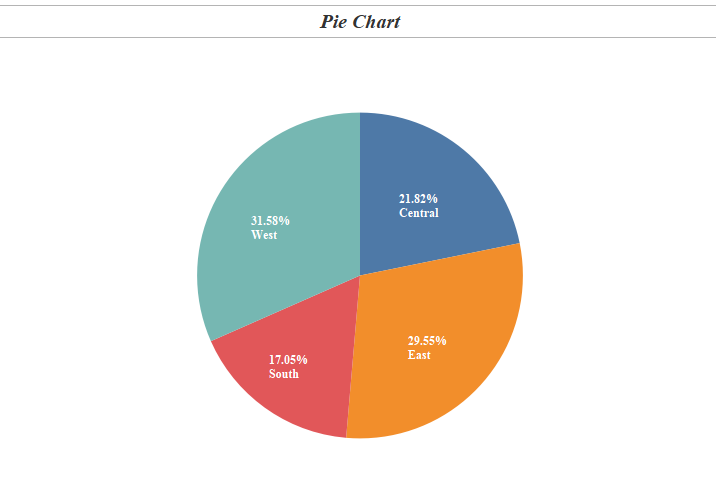
In the last blog in the series Tableau Charts we talked about Symbols & Filled Maps . Today we will talk about a most common chart type […]
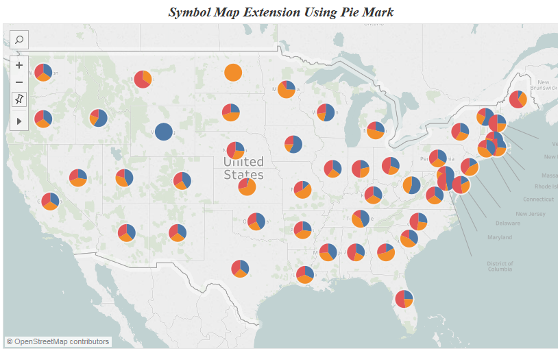
In the previous blog we looked into Heat Maps & Highlight Tables . In tableau when we are dealing with geographic variable we have two options : […]
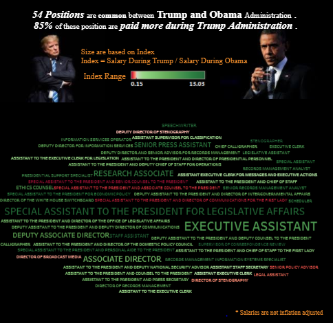
In this blog I tried to visualise how salaries were being paid across different positions under Obama and Trump. The total number of positions under […]
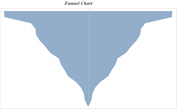
Hi All, In this blog of Advanced Charting using tableau we will see how to build a funnel chart / diverging bar chart in tableau. […]
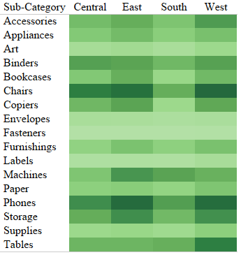
Hi All, In the previous blog in the series Tableau Charts we talked about Text Tables . Today we are going to talk about an extension of […]
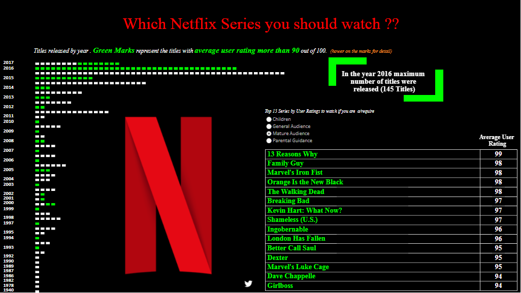
I recently came across a dataset that had the viewers ratings of Netflix shows released by year. I did not go into the dataset to […]
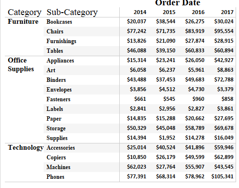
Hi All, In the earlier post in this series we talked about Bar Chart and Variants . In this post and the following we will discuss about […]
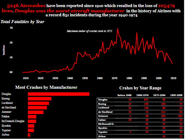
While scavenging for data I came through this dataset which had a list of all the aircraft crashes ( millitary and non millitary ) across […]
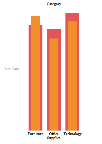
Hi All, In today blog I will write about how we can create a bar chart within a bar chart . This is how a […]
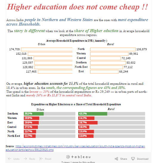
Hi All, This is the first in series of my News Makeover in which I would be building vizzess based on news articles that I […]
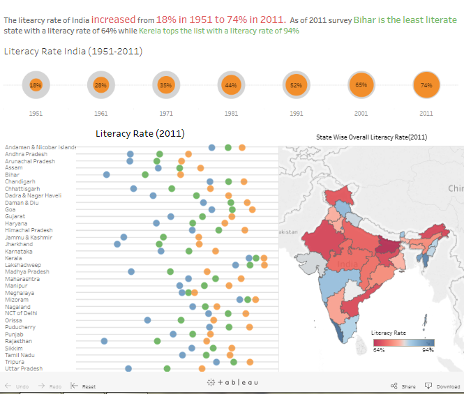
Literacy rate in India increased from a mere 18% in 1951 to 74% as of 2011. As of 2011 Bihar was the least literate state […]
Copyright © 2026 | WordPress Theme by MH Themes