
In the previous article we discussed about how to build and interpret a Histogram in Tableau . Today we will be discussing about how to build up a Box and Whisker plot in Tableau. Before we build this plot let us try to understand the different component in a box in whisker plot.
This is what it looks like:
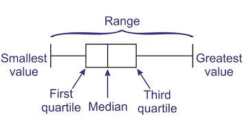
There are five components in a box plot.
The lower end of the line(also called as whisker) represents the minimum value and the upper end of the line represents the maximum value . When a box plot is build it generally seperates the outliers from the data. These outliers(if any) are represented by dots.
The lower end of the box is the First quartile and upper end is the Third quartile . The median is represnetd by the line between them .
Now as we have gained some information about this plot lets try to build this up in tableau . This time we would be using the same data that we used when we build up a histogram : World Economic Indicators.
Step1: Select Region and Birthrate and then click on the box plot icon in the show me tab.
Step 2: Dran region in the Columns pill.
Step 3: Go to the Analysis tab on the toolbar and in the dropdown uncheck the agrregrate option.
This is what your screen should be looking right now:
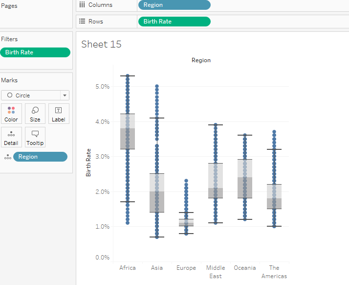
We have our box plot ready and what we require is to do a bit of formatting to our plot.
To format the plot left click on any of the box and you will see a option window appearing with the three options Edit , Format and Remove. Select Edit.
In the edit option make sure you have the Hide Underlying Marks option checked.
If you want to include the outliers as well in the plot , under the plot options select the extent of whiskers to the maximum extent of the data.
Your screen should now look like this (if you have selected maximum extent of the data in plot options )
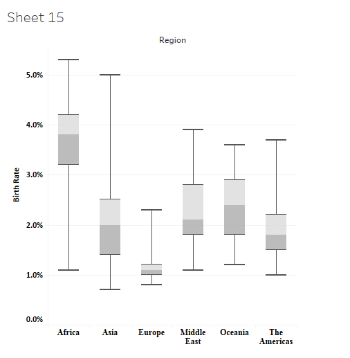
This plot tell us the median , maximum and the minimum birth rate in the regions. Using this plot we can tell that the median birth rate is the maximum in Africa while it is the least in Europe.
The box and whisker plot is a bit more complex than the other chart types. Do let me know if you are not able to follow or have any questions regarding the same.
Hope you guys enjoyed it.