
Salaries Under Obama And Trump
In this blog I tried to visualise how salaries were being paid across different positions under Obama and Trump. The total number of positions under […]

In this blog I tried to visualise how salaries were being paid across different positions under Obama and Trump. The total number of positions under […]
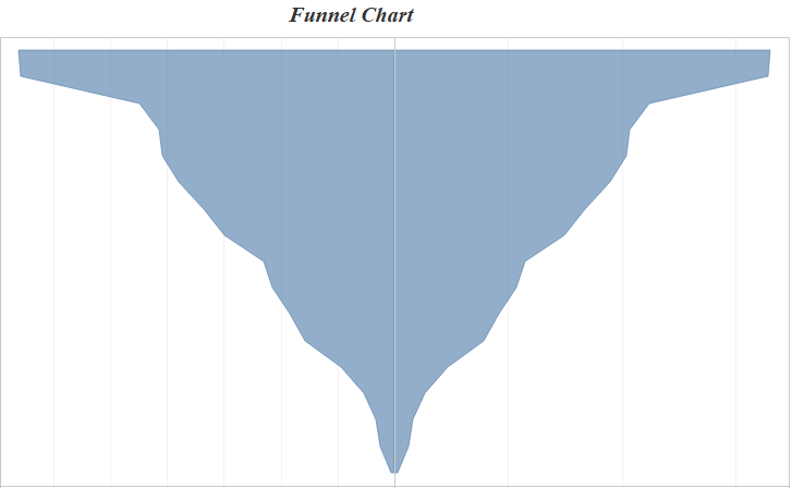
Hi All, In this blog of Advanced Charting using tableau we will see how to build a funnel chart / diverging bar chart in tableau. […]
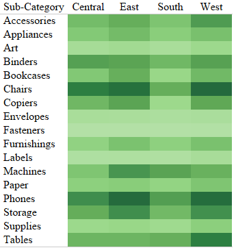
Hi All, In the previous blog in the series Tableau Charts we talked about Text Tables . Today we are going to talk about an extension of […]
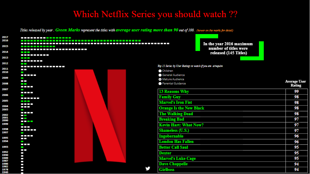
I recently came across a dataset that had the viewers ratings of Netflix shows released by year. I did not go into the dataset to […]
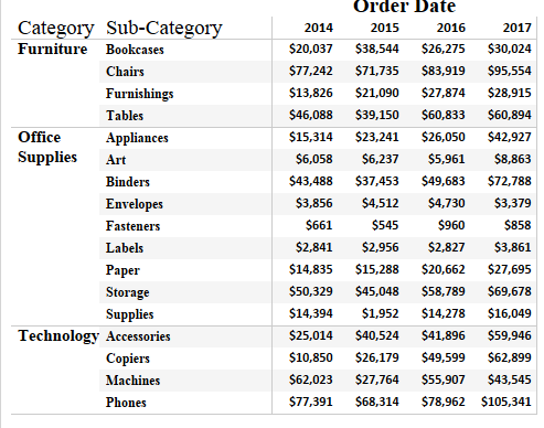
Hi All, In the earlier post in this series we talked about Bar Chart and Variants . In this post and the following we will discuss about […]
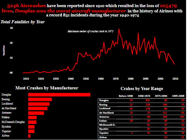
While scavenging for data I came through this dataset which had a list of all the aircraft crashes ( millitary and non millitary ) across […]
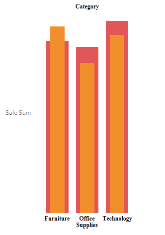
Hi All, In today blog I will write about how we can create a bar chart within a bar chart . This is how a […]
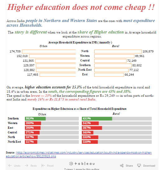
Hi All, This is the first in series of my News Makeover in which I would be building vizzess based on news articles that I […]
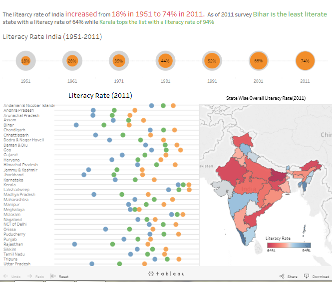
Literacy rate in India increased from a mere 18% in 1951 to 74% as of 2011. As of 2011 Bihar was the least literate state […]
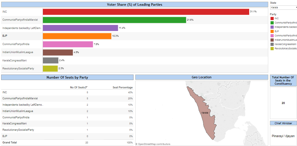
Members of the 16th Lok Sabha were elected during the 2014 Indian general election. The elections were conducted in 9 phases from 7 April 2014 […]
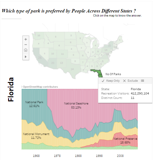
In this blog I have tried to visualize the data which had information about Number of Recreational Visitors in Parks across US States. The following […]
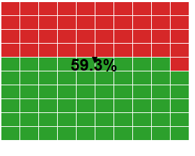
Hi All, In this blog I am going to take you step by step to create a waffle chart. A waffle chart is the best […]
Copyright © 2025 | WordPress Theme by MH Themes